wayfair

Product Design Co-Op

Login & Authentication Team

June 2021 - December 2021

Figma, Sketch, Miro, User Testing


As a Product Design Co-Op at Wayfair, I had the opportunity to work alongside the Login and Authentication Team. Throughout my co-op, I collaborated with other product designers, product managers, engineers, developers, accessibility experts, and user researchers to work towards finding the best design solutions for three main projects: blocking bad/leaked passwords, redesigning “passwordless” sign-in enrollment, and account information settings.

blocking bad/leaked passwords


Discovered a design solution to persuade users to update their passwords in the scenario of it being leaked elsewhere, or if it is a commonly used bad password.

The problem, insights, strategy, and solution for the Blocking Bad/Leaked Passwords Project
 
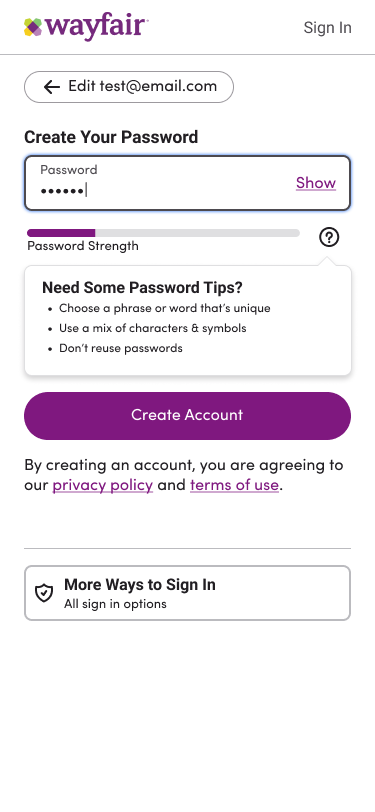
Iteration of bad password error: a password strength bar with tips on how to improve it.
Iteration of bad password error: Alert that the user's entered password does not look secure.
Iteration of bad password error: alerting users that the password has leaked on another website.
Iteration of bad password error: alerting user that the password they entered does not look secure.

Different Iterations of “error banner” to help alert and persuade users that their password should be more secure.

account info settings


Designed a scalable account info settings page that will house passwordless enrollment method management in addition to existing account information and security settings.

The problem, insights, strategy, and solution for the Account Info Settings Project.
 
A Functionality Requirements Matrix detailing the states, actions, and statuses needed for the page.

Functionality Matrix

 
Scalable and Interchangeable “Building Blocks” for the Account Information

Scalable and Interchangeable “Building Blocks” for Account Information

Overview of the account information page design for both mobile and desktop view.

Account Information Settings Page Design Concept Overview

redesign: biometric and SMS authentication enrollment


Reimagined the user experience of enrolling in biometric and SMS authentication to include better education regarding the value of increasing account security.

The problem, insights, strategy, and solution for the redesign of Biometric and SMS Authentication Enrollment Project.


User flow diagram showcasing how a user would arrive at and go through the process of enrolling in SMS or biometric authentication.

Enrollment User Flow

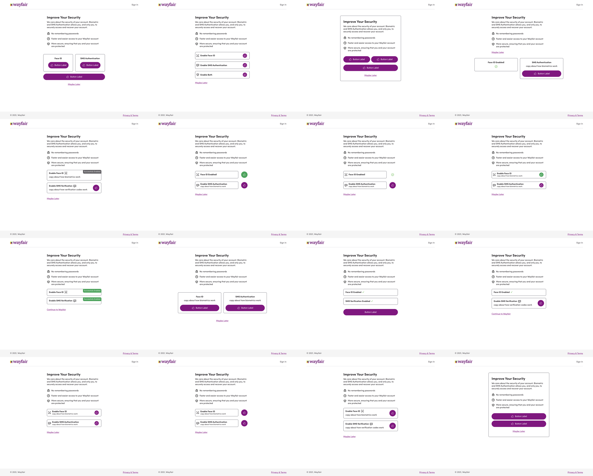
Grid of iterations for the design of the "Improve Your Security" hub page.

Multiple Iterations of the “Improve Your Security” Hub Design Concept

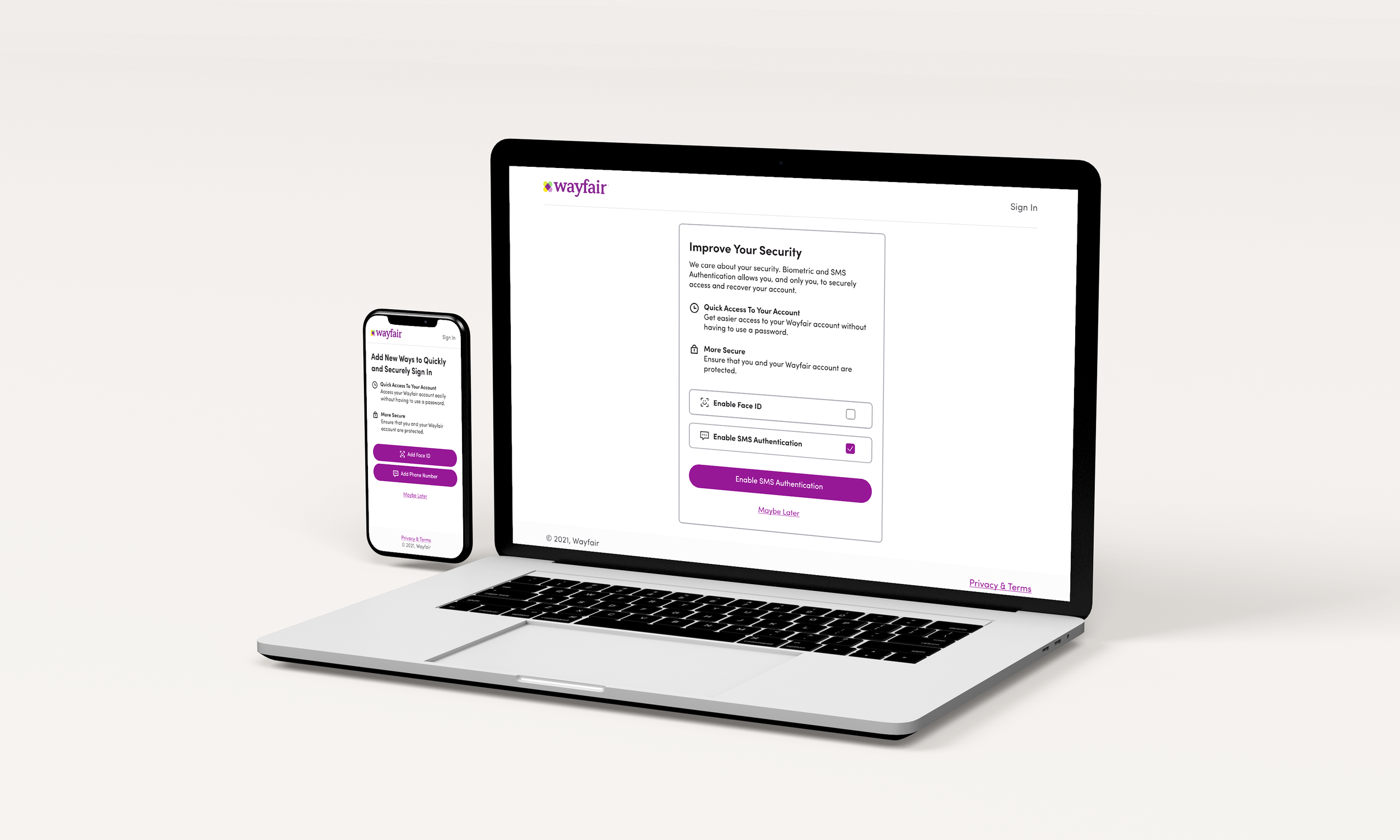
Overview of the Improve Your Security Hub design for both mobile and desktop view.

“Improve Your Security” Hub Design Concept Overview

Sequence of screens seen throughout the new Enrollment concept flow.

Sequence of Screens for Redesigned Enrollment Flow

User Test Flow

 
Previous
Previous

oversite - dark patterns

Next
Next

graphic design